Why Your B2B Website Isn't Selling: 5 UX Mistakes Killing Your Conversion Rate
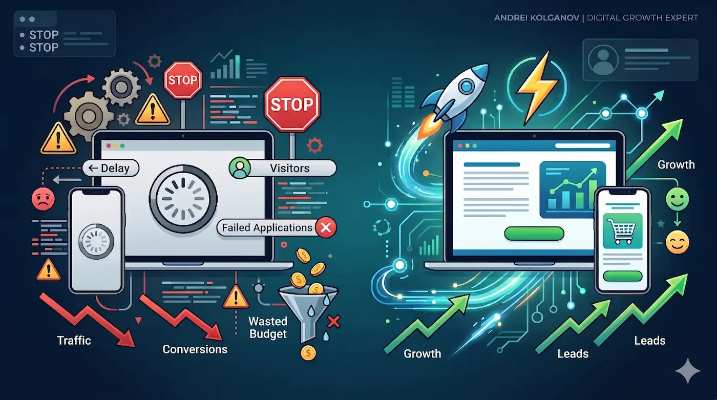
The "Leaky Bucket" Problem
You launched the Google Ads campaigns. You invested in technical SEO. Google Analytics shows your traffic is steadily growing. But the phone isn't ringing, and your CRM pipeline is completely empty.
At this exact moment, many B2B founders make a fatal mistake: they increase their ad budget, thinking they "just need more eyeballs." But if you have a massive hole in your bucket, pouring more water into it is pointless.
The problem isn't the traffic. The problem is what happens after the click. The user lands on your site and gets confused, frustrated, or bored. In the enterprise B2B sector, the cost of a poor User Experience (UX) is astronomical: a single frustrated user bouncing from your site can mean a lost $5M contract.
Let's audit your current digital architecture for the 5 deadly sins of B2B UX design.
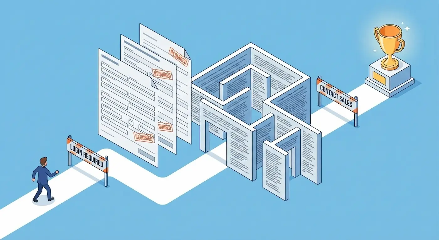
Mistake #1: The "Interrogation" Form (Asking for a Blood Test)
Marketers love data. They want to know everything upfront: Name, Phone, Corporate Email, Company Name, Job Title, Annual Revenue, and maybe the CEO's shoe size.
- The Reality: Every extra input field decreases your conversion rate by 15-20%. B2B decision-makers are incredibly busy. When they see an 8-field interrogation form, they simply close the tab.
- The Engineering Fix: * Rule of 3: Leave a maximum of 3 fields for initial contact (Name, Corporate Email). Your sales team will find out the rest during the discovery call.
- Progressive Profiling: If your CRM supports it, ask for additional info only when the user returns.
- Multi-Step Forms: Break the friction down. Ask an easy question first ("What service are you looking for?"), and ask for contact details on the next step.
Mistake #2: "We-Centric" Copy & Corporate Fluff
Go to your homepage right now and count how many times you say "We" ("We are leaders," "We offer," "Our mission") versus how many times you say "You" ("You will save," "Your ROI").
If "We" wins, your pipeline is losing.Buyers do not care about your "dynamically developing company." They care about solving their immediate business pain. The second part of this mistake is using corporate jargon. "We deliver synergistic integrations for paradigm-shifting workflows..." Stop. No human being speaks like this.
- The Fix: Write entirely about client outcomes. Instead of "We manufacture industrial machines," write "Reduce your manufacturing defects by 30% with our automated machinery." Keep headings punchy and strictly benefit-driven.
Mistake #3: Buried Trust Signals
In B2B, purchasing is an exercise in risk management. If a procurement manager hires a bad vendor, they could lose their job. Therefore, they are desperately looking for proof of reliability.
A common mistake is hiding case studies deep in the navigation menu, failing to display client logos, and omitting security certifications. Without these, your site looks like a beautiful brochure for a fly-by-night operation.
- The Fix: * Above the Fold: Place 4-5 recognizable client logos directly under your main Hero Section heading.
- Data-Driven Cases: Don't just show screenshots. Show hard numbers (Before / After ROI).
- Real Humans: Delete the stock photos of people shaking hands. Show your actual team, office, or manufacturing floor. Authenticity converts.
Mistake #4: "Ghost" Buttons (Weak CTAs)
The word "Submit" is a database command, not a Call-to-Action. The phrase "Contact Us" is abstract and intimidating. Contact you for what? How long will it take? Who will answer?
The user must have absolute clarity on what happens after they click. The fear of the unknown creates UX friction and kills clicks.
- The Fix: Use specific, action-oriented verbs combined with a clear benefit.
- Instead of "Submit" ➔ "Get a Custom Quote"
- Instead of "Order" ➔ "Book a Technical Demo"
- Instead of "Contact" ➔ "Speak with an Engineer"
Mistake #5: Ignoring the Mobile B2B Buyer
"Our buyers are CEOs; they only browse from large desktop monitors in the office."
This is a dangerous myth from 2010. Today’s executives review vendor links sent via Slack or LinkedIn while commuting, standing in an elevator, or waiting for a flight. If your mobile site requires them to "pinch and zoom" to read text, or if the mobile menu blocks the main CTA button (the classic "Fat Finger" effect), you just lost a lead.
- The Fix: Do the commute test. Open your website on your phone right now. Try to navigate and submit a lead form using only one hand (your thumb). If it feels clumsy, your architecture needs an overhaul.
Summary: Design is Not Just About "Looking Pretty"
In B2B, UX design is the lubricant for your sales funnel. Its sole purpose is to eliminate friction and guide the client effortlessly to the conversion point.
Sometimes, simply cutting three fields from a form and rewriting the main heading can double your inbound leads overnight—without spending a single extra dollar on paid ads.
Do you feel like your website is underperforming? Let's find the bottlenecks. Book a CRO (Conversion Rate Optimization) Audit, and I will show you exactly where you are losing revenue.
Read new articles:


Рентабельные рекламные кампании в Яндекс.Директ
Настроим и будем вести контекстную и таргетированную рекламу для вашего бизнеса
Создадим систему привлечения новых клиентов
Уменьшим цену входящего звонка и заявки
Увеличим заказы на маркетплейсах: Ozon, Yandex Market, WB
Подготовим понятные отчеты и аналитику

