
See the Big Picture: Building a Management Dashboard in Looker Studio

It's Monday morning. You open Google Ads to check ad spend, log into your CRM to count leads, export everything to Excel, and cross-reference Google Analytics 4 for traffic. Two hours later, you have a fragmented report and zero energy left for actual decision-making.
This is "Excel Hell." In 2025, manual reporting is an unacceptable waste of time. Data should flow automatically.
Looker Studio vs. Manual Spreadsheets
Looker Studio (formerly Google Data Studio) is a drag-and-drop visualization platform that acts as your business's live command center.
Dashboard Architecture: Connecting Your Data
Before building charts, you need to route your data using Connectors.
- Native Google Connectors (Free): Seamlessly integrates with Google Analytics 4, Google Ads, Search Console, YouTube, and Google Sheets.
- Third-Party Data (CRM, Meta Ads): Use paid partner connectors (like Supermetrics) for direct API links, or export third-party data into Google Sheets for a free, manual workaround.
Building Your First Report in 15 Minutes
- Initialize: Go to
lookerstudio.google.com, click Create, then Report. - Connect Data: Select Google Analytics 4, choose your property, and click Add.
- Add Core KPIs: Click Add a chart > Scorecard. Select metrics like Key Events or Active Users for a high-level overview.
- Track Trends: Add a Time series chart (Dimension: Date, Metric: Users) to visualize growth.
- Enable Interactivity: Click Add a control > Date range control. Place it in the top right to let users instantly filter the entire dashboard.
Advanced Tactic: Data Blending
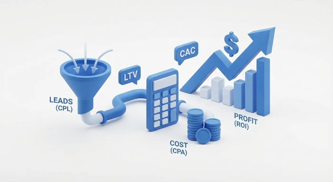
To calculate true Cost Per Acquisition (CPA), you must merge cost data (Google Ads) with conversion data (GA4). Looker Studio's Data Blending function uses "Date" as a join key, allowing you to create custom calculated fields (e.g., Ad Spend / GA4 Leads) on a single, automated chart.
Golden Rules of Dashboard UX
- The Inverted Pyramid: Place high-level KPIs (Revenue, Leads) at the top, trend charts in the middle, and granular data tables at the bottom.
- The 7-Widget Limit: Never clutter a single page with more than 5–7 widgets. Use multiple pages if necessary.
- Conditional Formatting: Use "Traffic Light" colors (green for hitting targets, red for negative deviations) to instantly highlight problems.
You can share your dashboard via a simple read-only link, grant edit access to your team, or schedule automated PDF emails every Monday morning. Looker Studio won't fix your business problems, but it will expose them honestly and instantly.
Do you want to draft the meta title and description for this post to ensure it ranks well for B2B searches?
Read new articles:








Рентабельные рекламные кампании в Яндекс.Директ
Настроим и будем вести контекстную и таргетированную рекламу для вашего бизнеса
Создадим систему привлечения новых клиентов
Уменьшим цену входящего звонка и заявки
Увеличим заказы на маркетплейсах: Ozon, Yandex Market, WB
Подготовим понятные отчеты и аналитику