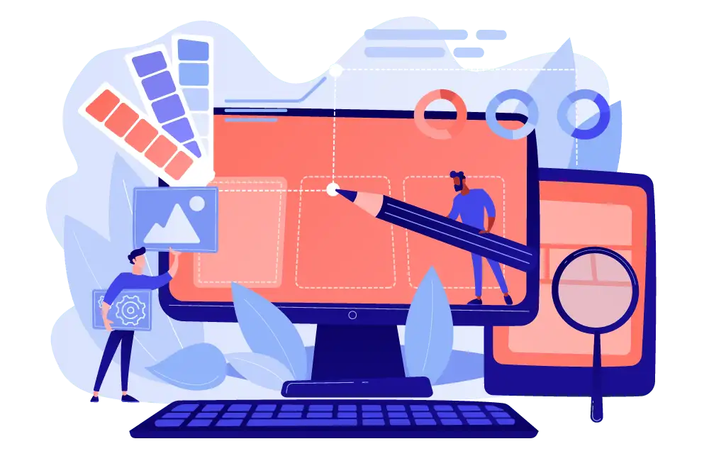
Fluid Pixel-Perfect: Bridging the Gap Between Figma and Responsive Web Engineering
The Expectation vs. The Reality
You just approved the perfect Figma file. Every drop shadow, grid alignment, and font weight has been meticulously crafted by your art director. But when the development team sends over the staging link, you immediately feel it: "Something is off." The button is slightly wider, the headline breaks onto an awkward second line, and the site looks entirely different on your MacBook than it does on your colleague’s Windows monitor.
This is where the demand for a "Pixel-Perfect" build originates. In theory, it means the coded website must match the design file 100%. But in the modern reality of fluid, responsive web development, is a rigid pixel-perfect approach actually what you want?
What Does "Pixel-Perfect" Actually Mean?
In the classic sense, pixel-perfect development is tested by overlaying a semi-transparent image of the Figma design directly on top of the live website. If the lines match up flawlessly, the job is done.
For high-end design agencies and enterprise brands, this is the standard of digital "haute couture." It demonstrates the developer's mastery and the agency's uncompromising attention to detail.
Why does this matter to the business?
- Trust: If a tech team cannot properly align a button, how can a client trust them with complex backend integrations or security?
- Brand Guidelines: In large corporations, a 24px padding rule is the law, not a creative suggestion.
- Premium Aesthetics: A mathematically aligned website simply feels more expensive, cohesive, and professional.
The Pitfalls: Where Rigid Pixel-Perfect Fails
Despite its premium reputation, enforcing a rigid pixel-perfect build (using fixed pixel values everywhere) introduces three critical engineering flaws:
1. The Static Canvas vs. The Fluid Web
A designer draws a static picture for a specific screen width (e.g., 1440px). But users view the site on thousands of different device dimensions. Hardcoding fixed pixels turns the website into a brittle, concrete structure: it looks flawless on a 1440px monitor, but it breaks, overlaps, or creates horizontal scrolling on a 1300px laptop.
2. The Physics of Font Rendering
macOS, Windows, and iOS use fundamentally different rendering engines for typography (CoreText vs. DirectWrite). The exact same font file might take up 300px of width in Chrome on a Mac, and 305px in Edge on a PC. Demanding 100% letter-to-letter matching across all devices is fighting the physics of the browser.
3. The Reality of Dynamic Content (CMS)
In Figma, your hero section features a perfectly balanced, two-word headline. Six months after launch, the client’s marketing team updates the CMS with a five-word headline. A rigid pixel-perfect build will break the layout. A properly engineered fluid build will adapt to it.
The Modern Approach: Fluid Pixel-Perfect Engineering
As a Senior Webflow Engineer, I don't copy pixels; I translate proportions, logic, and design intent. We use a Fluid Pixel-Perfect approach:
- Relative Units over Fixed Pixels: Instead of telling a button to "be exactly 200px wide," we engineer it using
REM,%, andVW/VH. This tells the element to scale proportionally based on the user's screen size and accessibility settings. - The Client-First Methodology: We build on the industry-standard Finsweet Client-First framework. This creates a scalable system of spacing and typography classes. If a client adds a new section a year from now, the spacing remains mathematically perfect.
- Fluid Typography (CSS Clamps): Fonts smoothly scale up and down based on the viewport width, preserving the exact "vibe" of the Figma file without sacrificing readability on mobile devices.
The Art Director's QA Checklist
If you are an agency owner or art director evaluating a developer's staging link, don't just overlay the Figma file. Check these three engineering pillars:
- Systematic Consistency: Do identical UI elements (buttons, cards, H2s) share the exact same padding and behavioral logic across the entire site?
- Fluid Responsiveness: Slowly resize your browser window. Elements should reflow smoothly without sudden jumps, overlaps, or horizontal overflow.
- Content Integrity: Does the design architecture hold up if you swap an image or double the length of a paragraph via the CMS?
Summary
Pixel-perfect development is no longer about fanatically adhering to a static grid. It is about respecting the design intent and successfully translating it into a living, breathing digital environment. A truly premium website is one that looks "perfect" not just on the art director's 5K display, but in the hands of a B2B buyer on a standard corporate laptop.
Don't let poor development compromise your design deliverables. If you are a design agency looking for a Tech Partner who can translate your complex Figma files into flawless, fluid Webflow architectures, send me a DM or book a technical consultation today.
Read new articles:


Рентабельные рекламные кампании в Яндекс.Директ
Настроим и будем вести контекстную и таргетированную рекламу для вашего бизнеса
Создадим систему привлечения новых клиентов
Уменьшим цену входящего звонка и заявки
Увеличим заказы на маркетплейсах: Ozon, Yandex Market, WB
Подготовим понятные отчеты и аналитику

