The "Fat Finger" Effect: Why Your Mobile Website is Killing Conversions (Despite Looking Beautiful)
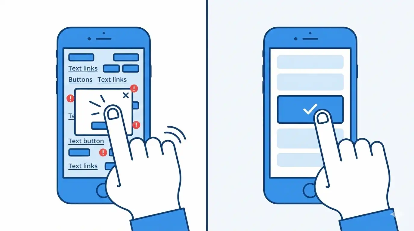
Picture this: your potential B2B client is commuting, holding their smartphone in one hand, and trying to download your latest whitepaper. They see the button, tap it with their thumb, but... they accidentally hit the adjacent legal link instead. Or worse, they try to close a pop-up modal, but the "X" is so microscopic that they click the ad itself.
After three frustrating attempts, they simply close the tab. You just lost a lead.
This is the "Fat Finger" Effect. It is the exact reason why enterprise websites that look flawless on a designer’s 27-inch Mac monitor often turn into a high-friction nightmare for actual users on mobile devices.
Let's break down how to engineer a mobile UX that is friendly to your users' hands, not just their eyes.
1. The 44-Pixel Rule (Touch Target Sizing)
Unlike a desktop mouse cursor, which has a precision point of exactly 1 pixel, a human finger is a blunt instrument. The average width of an adult's index finger pad is between 10 to 14 millimeters.
Apple’s Human Interface Guidelines strictly state that the minimum touch target size must be 44x44 pixels. Google’s Material Design recommends an even larger 48x48 pixels.
The Business Impact: If your "Request Demo" or "Call Now" buttons are smaller than this, you are forcing your clients to play a frustrating game of sniper. B2B buyers do not want to fight your DOM architecture; they want to solve their business problems.
2. Architecting for the "Thumb Zone"
Extensive UX research shows that roughly 75% of users navigate their smartphones using a single thumb. Because of human anatomy, the viewport is divided into distinct zones of reachability:
- The Green Zone (Center & Bottom): The thumb reaches this area effortlessly. This is exactly where your primary Calls-to-Action (CTAs) and critical navigation must live.
- The Yellow Zone (Middle Edges): Requires a slight, but manageable, stretching of the thumb.
- The Red Zone (Top Corners): To tap here, the user must either shift their grip entirely or use their second hand. Putting your main menu hamburger icon in the top left corner is a legacy habit, not a modern UX best practice.
3. Negative Space and Misclick Prevention
Often, the problem is not the size of the button itself, but the lack of spatial breathing room around it.
If you stack footer links like "Privacy Policy" and "Terms of Service" flush against each other, the user's thumb will inevitably trigger the wrong link. This creates micro-frustrations. When micro-frustrations accumulate, your bounce rate spikes.
- The Engineering Fix: Utilize CSS
gapormarginto ensure at least 8–10 pixels of inactive negative space between any two interactive elements.
4. The Microscopic "X" Problem
Modal pop-ups are a notorious UX pain point. Art directors often design the "close" icon (X) to be delicate and thin so it doesn't disrupt the visual layout. But on a mobile device, it becomes unclickable.
- The Result: The user tries to dismiss the modal, misses the 10px icon, clicks the background link instead, gets angry, and abandons the session.
- The Engineering Fix: Disconnect the visual size from the functional hitbox. The visible "X" icon can be a sleek 14px SVG, but we engineer its CSS
paddingto create an invisible, clickable radius of 44x44 pixels around it.
The Mobile Ergonomics Checklist
Audit your current website against these strict mobile standards:
- [ ] Giant Hitboxes: All critical buttons and links have a minimum clickable area of 44x44 pixels.
- [ ] Frictionless Inputs: Form fields (Name, Corporate Email) are tall enough to easily tap and trigger the mobile keyboard.
- [ ] Bottom-Heavy Navigation: High-priority actions (Shopping Cart, Search, Menu) are anchored to a sticky bottom bar, keeping them permanently in the Green Thumb Zone.
- [ ] Zero
:hoverDependency: Your conversion logic does not rely on "mouse hover" states, which do not exist on touchscreens. - [ ] The Commute Test: Try navigating your own website while walking, using only one hand. If it feels difficult, your architecture is losing you money.
Summary
A beautiful desktop design is only 50% of the battle. Real B2B conversions happen in the palm of your user's hand, exactly when they need you most. Respect the "Fat Finger" rule, engineer generous hitboxes, and stop forcing your clients to work hard just to give you their money.
Read new articles:


Рентабельные рекламные кампании в Яндекс.Директ
Настроим и будем вести контекстную и таргетированную рекламу для вашего бизнеса
Создадим систему привлечения новых клиентов
Уменьшим цену входящего звонка и заявки
Увеличим заказы на маркетплейсах: Ozon, Yandex Market, WB
Подготовим понятные отчеты и аналитику

